Audience Read
What the visual needs to signal.
a corporate video page earns its keep when it makes the audience, use case, creative choice, and next action easy to see without flattening the work into a sales sample.
Loading ECG Productions
Corporate
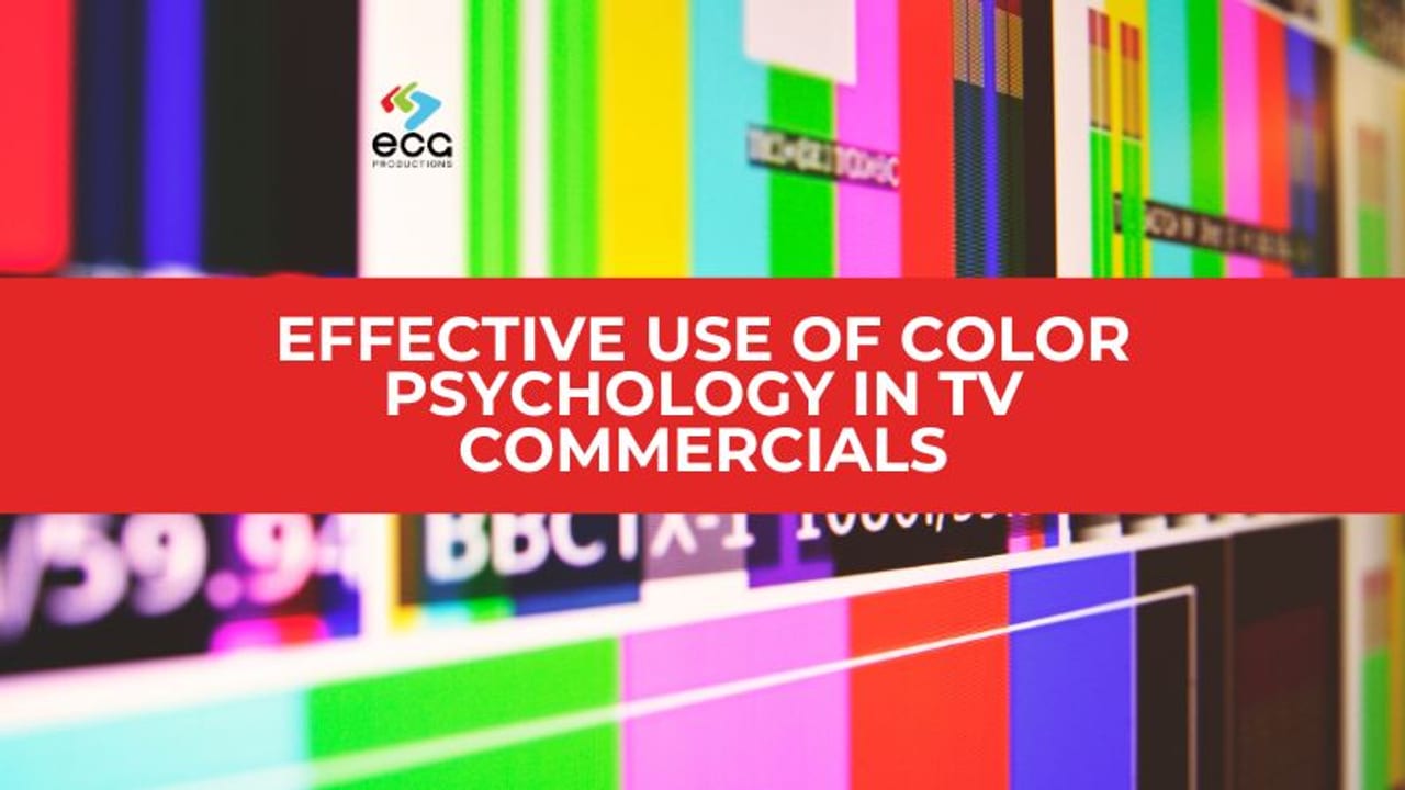
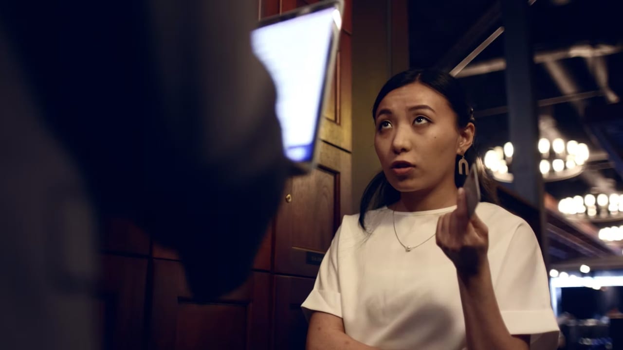
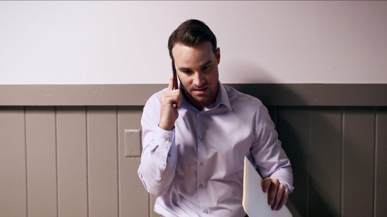
Effective Use of Color Psychology in TV Commercials frames a company, team, process, or stakeholder message around trust. The useful read is how the audience, production approach, interview or script structure, post-production finish, and delivery needs support a real business conversation.
Portfolio project
See the work, then talk through what it would take to make something with similar intent.
Training
Effective Use of Color Psychology in TV Commercials is a corporate video reference point with its own audience, tone, polish, and production shape. The nearby categories and services add context around how similar work comes together.
Project Reference
A strong reference does more than show style. It reveals audience, format, production value, finish, and the real-world details that shape the scope behind the work.
Audience Read
a corporate video page earns its keep when it makes the audience, use case, creative choice, and next action easy to see without flattening the work into a sales sample.
Production Read
The category, image, and nearby work show the territory around the project. The important read is how concept, production, post, versions, and distribution come together around a real audience.
Next Conversation
For a similar conversation, start with the audience, deliverables, where the finished video has to work, and how Corporate Video Production connects to the story the brand or client is trying to tell.
Planning A Similar Project
Effective Use of Color Psychology in TV Commercials is a corporate video reference, but the page has to do more than display the artifact. The strongest read connects who needed to care, where the finished piece had to live, and which production choices made the work feel credible.
Audience Read
a corporate video page earns its keep when it makes the audience, use case, creative choice, and next action easy to see without flattening the work into a sales sample.
Production Challenge
The category, image, and nearby work show the territory around the project. The important read is how concept, production, post, versions, and distribution come together around a real audience.
Next Step
For a similar conversation, start with the audience, deliverables, where the finished video has to work, and how Corporate Video Production connects to the story the brand or client is trying to tell.
Project Context
Effective Use of Color Psychology in TV Commercials shows the practical choices behind the work: audience, format, pacing, production value, finish, and the places a similar piece would need to live after launch.
Effective Use of Color Psychology in TV Commercials grounds the corporate video lane in finished work instead of a broad claim about capability.
A stronger project page names the client, audience, tone, capture or animation approach, crew or design system, finishing needs, rights considerations, and where the final piece needed to live.
For nearby corporate video work, the practical story is how creative direction, production, edit, color, sound, delivery versions, and approval details shaped the finished result.
More Work In This Lane
These categories show nearby ECG work by format, audience, style, and production need, so the project sits in a wider story instead of standing alone.
Related Services
These services connect the finished example to the practical choices your own project needs: creative development, production, post, animation, delivery, versions, and launch support.
ECG Staff Note
This page has missing context, media, or proof that staff can improve. Mason can interview you, accept approved links, take written notes, or use all three before creating a review draft.
Interview
Have Mason ask the missing questions.
Start hereSupply links
Add video, image, folder, transcript, or reference URLs.
Start hereChat / notes
Type context, restrictions, proof, and client details.
Start hereProject FAQ
Use this example to compare audience, format, production value, and what a similar project would need to prove.
Yes. This page is a reference point for the kind of corporate video work ECG can help plan, produce, edit, animate, finish, or adapt. The right shape depends on the audience, deadline, deliverables, locations, talent, approvals, and where the finished video has to live.
The page still gives context around audience fit, pacing, production value, brand presence, format, and how clearly the example supports its use case. That tells you more than style alone.
Corporate Video Production is the best starting point for this reference. From there, ECG can connect the work to pre-production, production, post-production, animation, versioning, and launch support as needed.
Related Articles
These ECG articles help connect corporate video work to planning, budgeting, creative decisions, production, and post-production.

Production
Production
For The Role of Celebrity Endorsements in TV Commercials, the production question is what has to be planned, captured, protected, and handed to post for the finished piece to work.
Read article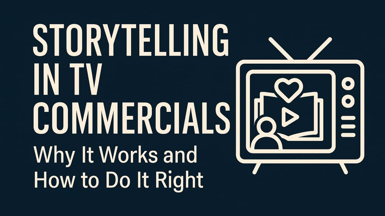
Strategy
Strategy
For teams weighing Why Storytelling Matters in TV Commercials, this connects audience, creative direction, distribution, and the decision to make before production dollars move.
Read article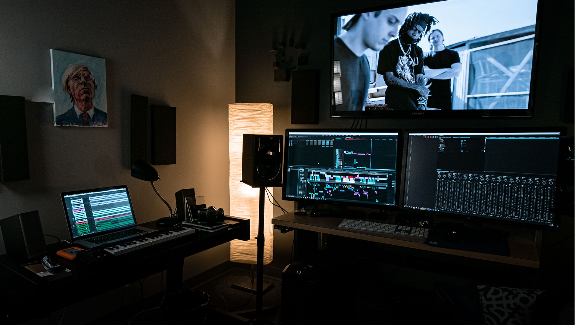
Post
Color
Color is not just polish. It is one of the ways a video tells the audience how to feel.
Read articleNearby Work
Training
Skillsoft | Global Import Compliance is training or education work where clarity has to survive real use: who needs to learn, what has to change, how the material is captured or animated, and where the final video has to live after approval.
Feb 2023
Open project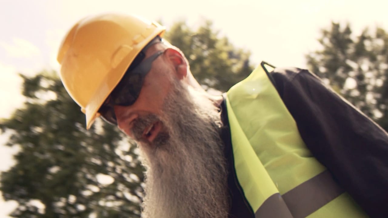
Training
Skillsoft | Heat Stress Awareness is training or education work where clarity has to survive real use: who needs to learn, what has to change, how the material is captured or animated, and where the final video has to live after approval.
Feb 2023
Open project
Training
SiteOne | Safety Training Video | Gloves is training or education work where clarity has to survive real use: who needs to learn, what has to change, how the material is captured or animated, and where the final video has to live after approval.
Sep 2022
Open project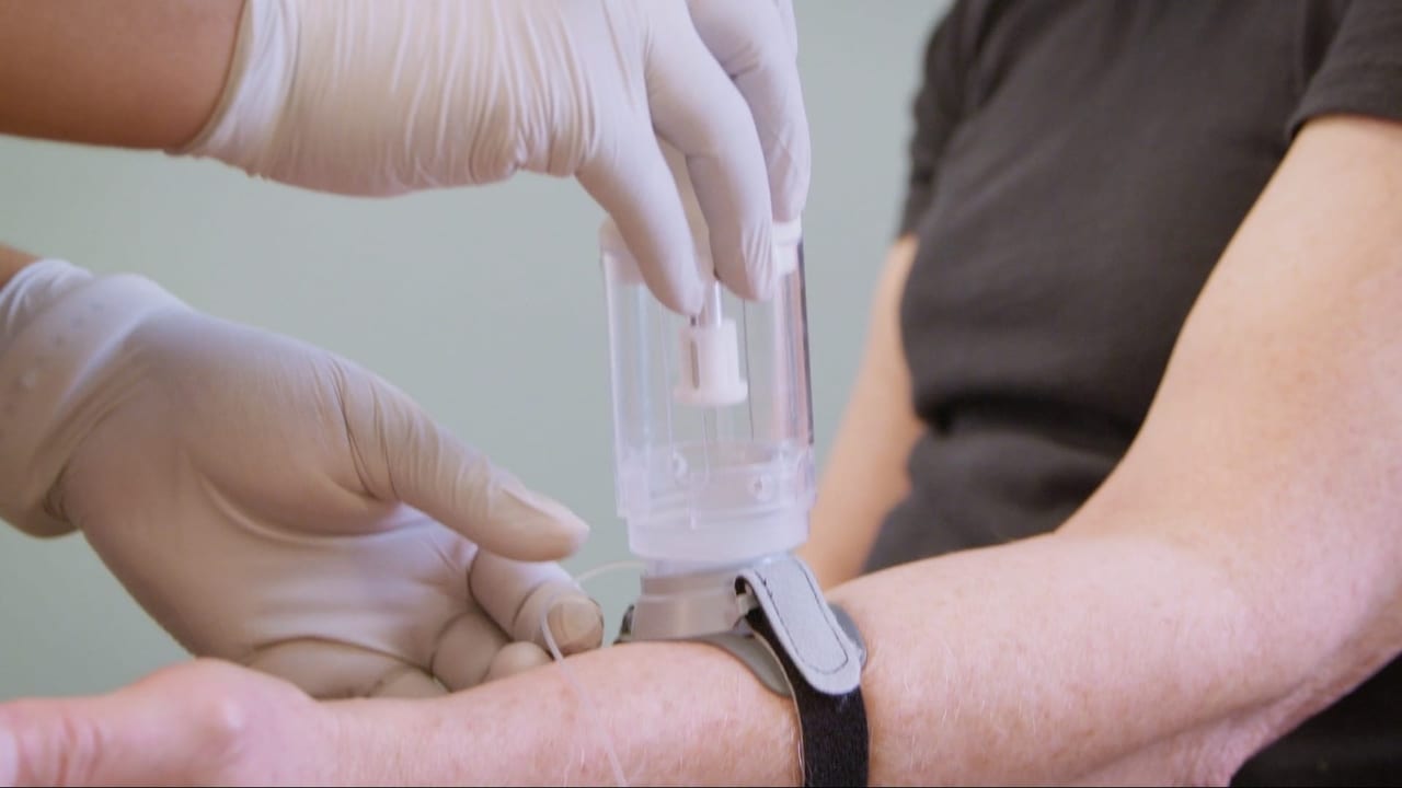
Training
Sorrento Therapeutics | Sofusa DoseConnect - Clinical Trial Training is training or education work where clarity has to survive real use: who needs to learn, what has to change, how the material is captured or animated, and where the final video has to live after approval.
Aug 2020
Open project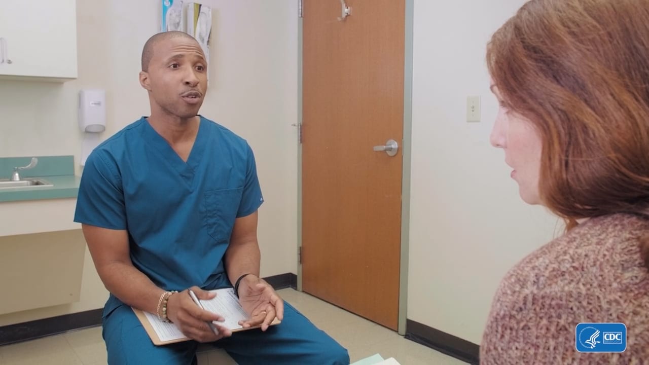
Training
CDC | Continuing Education Training Video is training or education work where clarity has to survive real use: who needs to learn, what has to change, how the material is captured or animated, and where the final video has to live after approval.
Jul 2020
Open projectKeep Exploring
Project pages connect the finished work to the services, related articles, and nearby examples that explain the craft and planning behind similar production needs.
Services
Use these when you want to compare the production, post, animation, or package path behind the need.
Service
Offline Editing from ECG Productions turns footage into a clearer story with stronger pacing, cleaner structure, and delivery-ready versions.
Open pageService
Online Editing from ECG Productions turns footage into a clearer story with stronger pacing, cleaner structure, and delivery-ready versions.
Open pageService
Video Editing from ECG Productions turns footage into a clearer story with stronger pacing, cleaner structure, and delivery-ready versions.
Open pageService
Voiceover from ECG Productions helps the finished video sound clearer, more controlled, and more useful in the final edit.
Open pageWork
Use examples to see what the service, article, or category can look like in finished work.
Corporate
Arthur Blank & Donna Hyland: A Powerful Fireside Chat frames a company, team, process, or stakeholder message around trust. The useful read is how the audience, prod...
Open pageCorporate
CHOA | 2021 Strong4Life Overview frames a company, team, process, or stakeholder message around trust. The useful read is how the audience, production approach, inte...
Open pageCommercials
P&G for the HBCYou anchors a campaign conversation around hook, tone, production value, and how quickly the message has to land. A similar commercial or promo needs...
Open pageRelated articles
These pieces add context around process, budget, creative choices, common mistakes, and what to ask next.
Post
A post-production read on Why Color Grading Doesn't Take Five Minutes, covering the edit, sound, color, graphics, delivery, and review choices that shape the final p...
Open pagePost
A post-production read on Color Correction vs. Color Grading, covering the edit, sound, color, graphics, delivery, and review choices that shape the final piece.
Open pageBudget
A practical look at what corporate video really costs, why scope matters, and how better planning protects the final piece.
Open pageProduction
For The Art and Science of Effective Television Commercials, the production question is what has to be planned, captured, protected, and handed to post for the finis...
Open pageNext step
When this starts to sound like your situation, bring ECG the goal and the constraints.
Share This Project
Share the article, project, or service page with a teammate, client, producer, or stakeholder who needs the context before the next decision.