- 1-855-787-4487
- info@ecgprod.com
- Mon - Fri: 10:00am - 6:30pm
Color is everywhere in film and video, but it’s rarely accidental. Behind every crimson sunset, desaturated dream sequence, or golden-hued hero shot is a deliberate choice made in post-production—thanks to color grading.
At its core, video color grading is more than just “making things look better.” It’s about shaping story and emotion with visual tone. It’s how you signal to your viewer what to feel before a single word of dialogue is spoken.
Let’s unpack how color grading works, where it came from, and how creative professionals use it to elevate everything from indie docs to national broadcast spots.

Color grading is the process of manipulating color, contrast, saturation, and luminance in video to achieve a desired aesthetic or emotional impact.
Think of it as the final layer of storytelling. After your footage is shot and edited, color grading is where you polish the visual tone and bring consistency across scenes. It can be subtle—like warming up a shot to add nostalgia—or bold, like tinting an entire scene blue to suggest isolation or tension.
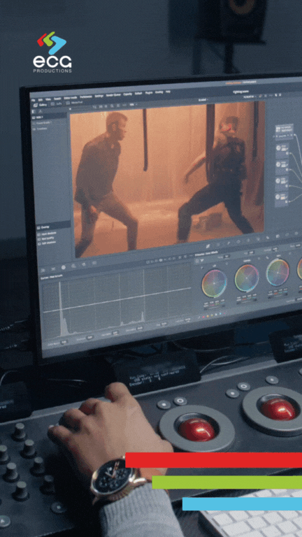
In modern post-production, color grading is typically done in software like DaVinci Resolve, Adobe Premiere Pro (with Lumetri), or Baselight, using high-resolution footage shot in flat or log color profiles. This gives colorists more dynamic range to play with, like digital painters working with a raw canvas.
Key distinctions:
Color correction = fixing exposure, white balance, or inconsistencies across shots.
Color grading = applying a creative or stylistic look that supports story and emotion.
While the two often go hand in hand, grading is where art meets technique.
To appreciate the power of modern color grading, it’s worth understanding how far we’ve come.
In the earliest days of cinema, everything was black and white—but that didn’t mean it lacked color. As early as the 1890s, filmmakers hand-tinted individual film frames to signal emotion or highlight action. By the 1920s, chemical processes like two-strip Technicolor brought red and green to the silver screen.
Then came three-strip Technicolor in the 1930s, which exploded into public consciousness with films like The Wizard of Oz
Audiences went from the dusty sepia tones of Kansas to the saturated brilliance of Oz—and color became a tool for transporting viewers across worlds.
Today, digital color grading gives filmmakers nearly unlimited control. You can shift skin tones, isolate specific hues, emulate vintage film stocks, or apply LUTs (lookup tables) for precise looks. With modern workflows, color grading is not just a technical necessity—it’s a creative superpower.
Because our brains are hardwired to respond to it.
Color psychology tells us that different hues trigger specific emotions and associations. Marketers use this all the time (think: red for urgency, blue for trust). Filmmakers do it too, but with far more nuance and artistry.
Common emotional associations:
Red: intensity, passion, danger
Blue: calm, sadness, detachment
Yellow: joy, madness, unease
Green: nature, envy, growth
Orange: warmth, nostalgia, warning
Purple: mystery, elegance, surrealism
But it’s not just the color—it’s the context. A bright yellow in a kids’ show feels cheerful. That same yellow in a crime thriller, paired with harsh lighting and silence? It’s eerie.
Video color grading helps reinforce genre, location, character development, and emotional tone—all without saying a word.

Let’s go beyond theory. Here are some iconic moments in film and television where video color grading doesn’t just look cool—it tells the story.
Steven Spielberg shot most of Schindler’s List in black and white—but one element stands out: a young girl wearing a red coat. The choice was made during grading, and it’s haunting. The color isolates her innocence amid chaos, making her presence—and eventual fate—emotionally devastating. It’s one of the most powerful uses of color as a storytelling device in cinema history.
Ever noticed how every scene inside the Matrix has a greenish tint? That was no accident. The green grading mimics old monochrome monitors, subtly cueing viewers that they’re inside a simulated world. When characters enter the “real” world, the grading shifts to cooler blues and neutrals. This visual code helps us navigate two realities—and it’s baked right into the color grade.
In Breaking Bad, yellow is everywhere—especially in the desert scenes or tense drug-making sequences. It’s more than a warm tone. The yellow in this series becomes a symbol of danger, chemical corruption, and moral ambiguity. Whether it’s the color of hazmat suits or sodium-lit rooms, the grade reinforces Walter White’s transformation and descent.
Denis Villeneuve’s Blade Runner sequel drenches its landscapes in surreal neons, deep oranges, and moody purples. In one unforgettable scene, a holographic Joi (a digital AI partner) embraces K, the protagonist, with both of them bathed in soft purple light. It’s beautiful—but hollow. The grade underscores the tension between human feeling and artificial intimacy.
Barry Jenkins’ Moonlight leans into a lush, expressive blue-and-pink palette that reflects the inner life of its main character, Chiron. The ocean scenes, in particular, glow with a deep, meditative blue that becomes a motif for identity, acceptance, and emotional release. The grade isn’t just aesthetic—it’s thematic.
These moments work because color was part of the creative conversation from the beginning—and elevated through expert grading in post.
So how do professionals achieve these video color grading effects?
Tools:
DaVinci Resolve: Industry standard with node-based grading.
Adobe Premiere Pro: Lumetri Color panel for editors and hybrid workflows.
Final Cut Pro: Powerful built-in color wheels and curves.
Baselight: High-end finishing for commercials and broadcast.
Techniques:
Primary Color Correction: Adjusting exposure, white balance, contrast.
Secondary Grading: Isolating specific areas (like skin tones or skies).
Look Creation: Using LUTs or manual grading to define a visual style.
Match Grading: Ensuring visual continuity across scenes or cameras.
Color Masks and Tracking: Targeting moving objects for dynamic color control.
Modern workflows often involve colorists collaborating early with DPs and directors to plan for grading during pre-production. That collaboration ensures the footage is captured with grading in mind—like shooting in RAW or log profiles for maximum flexibility.
DaVinci Resolve’s node-based workflow enables flexible, layered adjustments, where each node represents a specific tweak to color or effects. This setup allows colorists precise control to refine details without impacting other edits, making it ideal for professional, high-quality results.
Adobe Premiere Pro integrates seamlessly with other Adobe tools, allowing efficient workflows as assets move smoothly between programs like After Effects and Photoshop. This interconnected setup enhances speed and flexibility, ideal for complex projects.
Final Cut Pro X offers intuitive controls and a streamlined interface, enabling fast, high-quality color grading. Its user-friendly design makes it ideal for editors who need both speed and precision, especially on quick-turnaround projects.
You don’t have to be making a Hollywood feature to benefit from good color grading.
In fact, it may be even more essential for:
Commercials: Need to grab attention in seconds and establish brand identity.
Documentaries: Set tone, reflect mood shifts, highlight emotion.
Corporate Videos: Elevate production value and align with brand guidelines.
Social Campaigns: Ensure visual consistency across platforms and cutdowns.
In a world where people judge visual credibility in milliseconds, color grading is your secret weapon for standing out—and telling a story that feels intentional.
Final Thoughts: Color Is Your Silent Storyteller
Color grading is not just the cherry on top—it’s the glue that ties visual storytelling together. It helps define mood, shape audience perception, and make your message resonate emotionally. Done well, it’s invisible. But its impact is unforgettable.
At ECG Productions, we’ve delivered stunning color work across genres—from gritty docuseries to high-concept branded content. Whether you’re aiming for subtle realism or bold cinematic flair, our post-production team brings the technical chops and creative instincts to elevate your vision.
Ready to make your next video look—and feel—like a masterpiece?

CONTACT US
LET'S GET IN TOUCH
1-855 787-4487
Mon – Fri 9:00 AM – 6:00 PM EST
120 Interstate N Pkwy E SE #226
Atlanta, GA 30339
info@ecgprod.com

Unlock a new level of creativity and experience a truly unique and enjoyable working environment with ECG Productions. Contact us today to bring your vision to life with our award-winning video production services.
Copyright 2024 ECG Productions
Website by SuperMassive