Everything you know about color is (probably) wrong. Color is a topic that deserves volumes of books, and I will probably dive into color several times in other posts, but for now I will cover the basics of color and some lesser known facts about how it relates to film.
Color Theory contains the basics of understanding color. It explores all aspects of color and how color works. It is really all about how we can apply color and for artists, that is essential knowledge. Colors can affect us on an emotional and even physical level. We have very strong attachments to color as a society, and yet these associations can vary drastically culture to culture. For this post, I will focus on the standard western color associations.
Before we start, a little color theory vocabulary lesson. A Tint is how bright (or dark) a single color is. Saturation is how intense or washed out a color is. A Hue is the difference between colors, such as blue vs. green. Finally, Value is used to talk about how bright or dark something is regardless of the color. Now let’s begin.
You Are Wrong!
Forget everything you think you know about color! And I mean everything. You are probably wrong unless you have studied Color Theory. Even the basics you were taught are probably incorrect. We teach children, and many adults, that the primary colors are Red, Yellow, and Blue, but they aren’t. Not really.
You might remember the name Roy G Biv (red, orange, yellow, green, blue, indigo, violet), but this is actually inaccurate when naming the colors. For some reason, this mnemonic device has no room for cyan, while indigo and violet are both present even though they are virtually the same. I think it confuses cyan with blue, and confuses indigo as blue. Orange is really just a tertiary color between yellow and red, but there’s a slot for that as well. Allow me to explain.
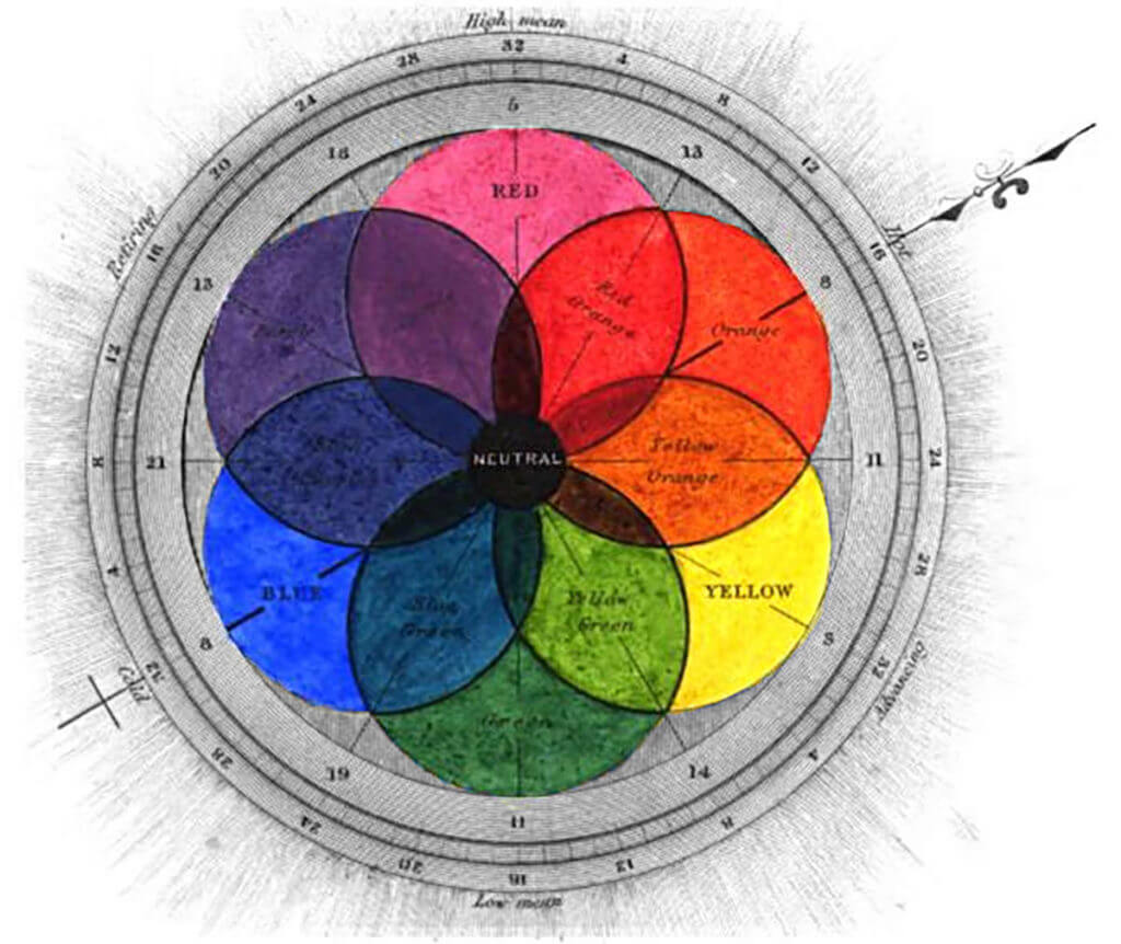
These colors (red, yellow, blue) are often referred to as the Painter’s Color Wheel, because painters for generations would use these colors in paint, mixing them to get other colors. This is partially due to the limitations of color reproduction technology, and the way pigments mix.
Let Me Explain
Paints use materials with various properties to portray different colors. They have different parts to them (such as binding agents) which can affect the way they reflect light. Further, the way pigments reflect color is different from the way the color of light itself works. Since we see color through light receptors in our eyes, we see colors differently than the way paint mixes. So even when we see pigments of paint, we are really seeing the colors of reflected light off of pigment, resin, solvent, and additives.
Film and monitors use light to portray images, not pigments. Therefore, their colors are more technically accurate to our eyes(although they too have limitations and issues which will be discussed in later posts.)
The Pigment Color Wheel, CMYK (cyan, magenta, yellow, black), is usually used for ink and printing. It is a very accurate color wheel like the light color wheel, and is actually closely related to it. The Pigment Color Wheel has it’s own uses and limitations, but we can go more into that one later.
Values of the Color Wheels
That isn’t to say these other color wheels don’t have their place. If you work with pigments and paints, these color wheels are invaluable to determine how reflected light off pigments will change colors when mixed. These types of color wheels usually work with color pencil, ink, paint, pastels, and other subtractive color mediums. These wheels are really tools artists use across various mediums to get the colors they want. We see the color of light. The goal is to mimic it.
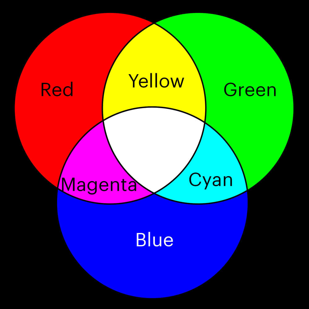
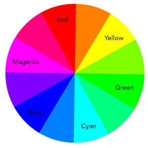
Red, Green, and Blue are the basic colors in light and therefore film. The secondary colors, Yellow, Cyan, and Magenta, are combinations of these. You can mix tertiary colors (orange, violet, etc) and all other colors from there as well.
As you can see from the image above, mixing the true primary colors of light will produce the secondary colors, which strongly resembles the Pigment Color Wheel, and all the colors make combined white. In pigments, the opposite is true, combining all colors makes black, or at least a very dark muddy grayish neutral color. For light, the brightness of the light will determine how dark or light the colors are and how much colors mix, making black a mere absence of light. When mixing all the colors produces black, it is a subtractive color wheel, and when they produce white, it is an additive color wheel.
Color Association
Many famous artists have studied and played with color. But one name in particular is synonymous with modern color theory, Josef Albers. Albers was a German artist who studied and taught at the Bauhaus school in Germany before coming to America and teaching at the Black Mountain College. For all you non-artists out there, just know these are the top modern art colleges of the 20th century.
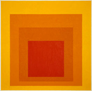
Josef Albers eventually went on to teach at Yale, where he primarily studied colors and the ways they interact with one another. He developed the theory of the Interaction of Color, and is probably most famous for his exploration of chromatic interactions in his series of square paintings.
Alber’s Homage to the Square
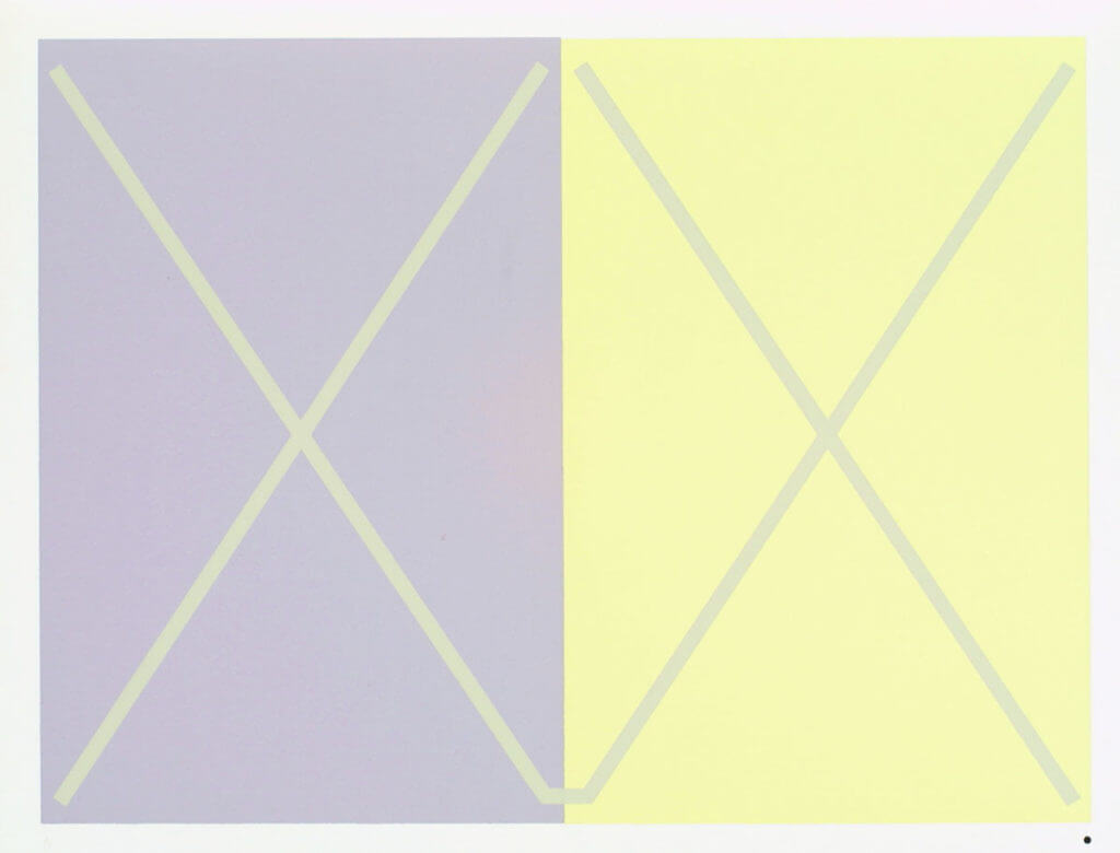
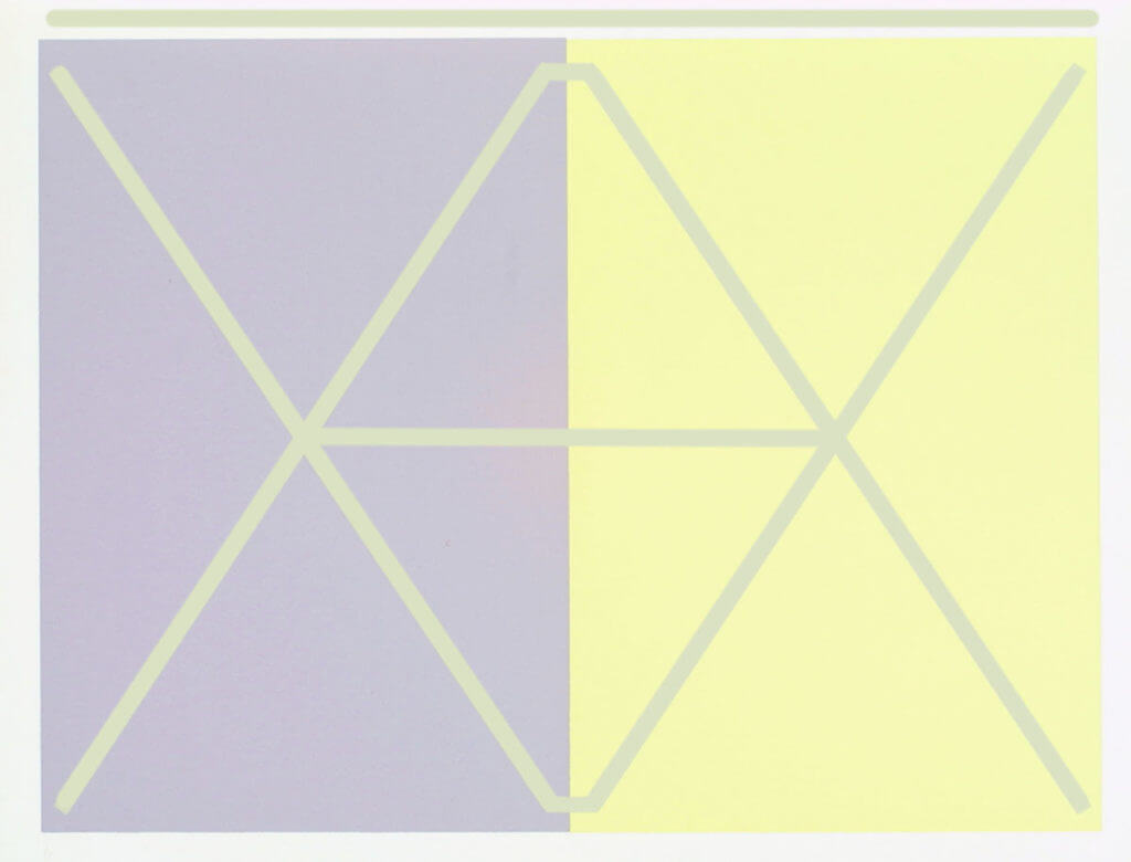
Albers discovered that colors can appear differently depending on the colors surrounding them. In fact, you can create some interesting illusions be placing colors next to or within field of other colors. In both of the examples below, Albers placed the same color inside the fields of other color. The two green squares are the same color square. The two Xs are also the same color.
Don’t believe me? Look at these:
Addressing Perception of Color
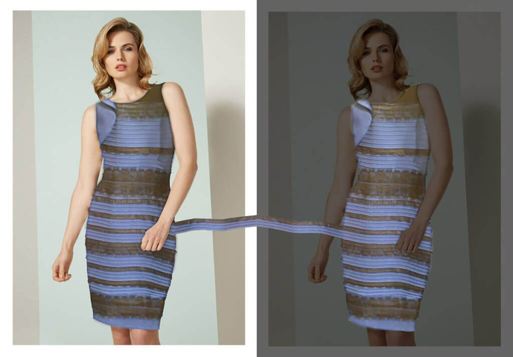
These are just some examples of how color interacting with each other can change how you see it. A more modern day version of this would be the infamous blue and black dress image. Many people see a white and gold dress, while others see a blue and black dress. While the dress itself is actually blue and black, the illusion of white and gold comes about because of the association of light in the image. I for one always see a black and blue dress, while others see only a white and gold dress. My wife claims it constantly switches on her as she is looking at it.
The color of the light appears to some to be white, and for others to be blue. When you perceive the light color as white, you see a blue and black dress, and when you think it is blue, you see a white and gold dress. Your mind doesn’t know what to think of it.
There are many more examples of this, but I want to come back to films. One thing all films do is adjust the color of the scenes for various reasons. For example, you shot a scene during the day, but the scene itself takes place at night.
Other times you want to achieve a specific color pallette for aesthetic purposes. Maybe they even want to drive story through color. In The Matrix and its sequels, all scenes shot with characters inside the Matrix were color corrected to have a green tint to it, which affects how you see all the colors in those shots and how you feel about those colors.
Nose-Blindness to Color?
Would you think this is a natural skin tone in the middle of a bright sunny day?
Of course not! That looks closure to pea soup vomit than middle-of-the-day skin tone. However in this scene, it is the exact color I pulled from the back of Morpheus’s head:
The warm red skin tones of Laurence Fishburne are actually muddy and green, and yet you see them as skin color because the scene is so green. I threw together an example of the scene with natural lighting:
Now the color correction I did is far from perfect, but you get the idea. Color interactions affect the way we see colors. This works because our brains do something called Sensory Adaptation, where it changes the baseline of our senses to fit our current circumstances.
That’s why you can become “nose-blind” in your home to that rotten fish smell, or why you don’t notice the sound of a running air conditioner after a while, or why the yellow lights in your house seem less yellow until you see a picture of it later. When we see an image, our brains sort of “color correct” the dominate color. We think of it as balanced, even though it isn’t.
Mood
So why color the matrix green in the first place? Well perhaps that has something to do with our western color associations. In other words, the way colors make us feel when we see them can affect the choices filmmakers use when making color decisions. In The Matrix, green is often associated with Corruption, Danger, and something Ominous.
Here are a few more examples of colors, and the moods and feelings with which we associate them.
- Red is often associated with heat, love, blood, sex, and danger. It is the color of power.
- Pink tends to represent innocence, femininity, and beauty. It is the color of empathy.
- Orange is an important one in film because it is associated with warmth, calm, and pleasantness. It is the color of stimulation and the setting sun.
- Yellow is typically a joyful color, but it can also evoke a sense of uneasiness, illness, naivety, and even madness.
- Green can be associated with nature and health. But if used on flesh tones it can be uneasy and sickly, or give an ominous feeling, representing corruption and danger.
- Cyan is similar to green in many ways, and is often used for both positive and negative moods. Cyan evokes a sense of coldness, calm, and melancholy, and colorists often make it the color of cadavers.
- Blue is my personal favorite. It is the color of night. It can evoke peacefulness, but it can evoke negative feelings like coldness and depression too.
- Violet / Purple is a very unusual color, often used to represent fantasy, creativity, wisdom, or spiritualism. This mysterious color is the color of royalty.
Now, this is a WAY oversimplified list. It doesn’t even include the many ways you can use these colors or combine them to get different effects. As I said before, these are also only the associations western cultures use, while other cultures will traditionally have different ones. Some of these are universal. But as western culture spreads throughout the world through cinema and tv, the differences between cultural color associations might slowly vanish.
Color Tension
In a previous post, I mentioned how contrast in the value levels of a film can build tension. The same is true with color. Even without drastic differences in the tints of a color, the hues of colors, when placed next to each other, can create visual tension.
Complementary colors are contrasting colors. They are colors that oppose the other on the color wheel, and provide visual tension and interest. But before you can figure out which colors are opposite each other, you first need to see and understand the True (or Light) Color Wheel.
This is the true color wheel. You can see the basics for using color here, though obviously you could add even more color between these (to a virtually infinite degree). When you look up a color wheel online, you will likely not find an accurate color wheel. Too many of them use Violet, or Blue-Green as secondary colors, and that is inaccurate.
So why is this wheel accurate and others are not? Math.
Yes, math and color actually work together. But that is a post for another day. Needless to say, you can multiply colors together, add them, subtract them, divide them… and only with this true color accurate color wheel can you do the math and get the results you expect.
Easing the Tension
Luckily, all the lay person really needs to know is the colors of this wheel are the most accurate for mixing colors for all mediums that use light. In other words monitors, film, etc. Since we see color through light, it is the most accurate to our eyes (after all, we use red, green, and blue sensitive cones in our eyes to see color).
To understand how the true color wheel works, you need to know that the primary colors (Red, Green, Blue) and secondary colors (Cyan, Magenta, Yellow) are opposites. Cyan and red are directly across from one another. That means you will get Cyan if you you remove all the red, and only the red, from white.
This is true with all colors opposite each other on the wheel.
The absence of all blue makes yellow. The absence of all green makes magenta. So next time you see cyan and think “that’s a blue-ish green” or “it’s a mix of blue and green” (or call it aqua or light blue or sky blue… please don’t, those are all different hues and tints), it would be more accurate to think “that’s the absence of red”.
So, colors that are their opposite on the true color wheel are the complete lack of the other color. They are also their complementary color. These colors work well together, and can provide visual tension and interest.
In this scene from La La Land, both Ryan Gosling and Emma Stone stand out from the background thanks to the value (brightness) contrast they are wearing, but Emma stands out far more because she is wearing a color that contrasts with the rest of the environment. Remember, yellow is the opposite of blue.
I’m Wrong Too!?
Alright, it’s time to come clean: the color wheel itself IS a cheat. Color is not actually circular. It is linear. All colors are just variations in the wavelength of light along the spectrum of light for some animals. Starting at the invisible ultraviolet wavelength (often used in black lights) at the bottom of the spectrum –just below what we typically call violet– and ending in the infrared wavelength (often used in night vision) at the top of the spectrum, just above red.
The spectrum actually extends far far beyond that in both directions, but typically this is the range animals are able to see, while us humans can only see from violet to red.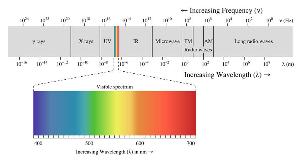 For whatever reason, we are able to use the color wheel to mix colors, and create contrasting colors. Somehow we are able to bend the linear spectrum of light around on itself and get a working theory of color interaction.
Different Shades of Opinion
My current theory of why this works involves something musicians call harmonic resonance frequency. The wavelengths of light, just like the wavelengths of sound, could “resonate” at certain frequencies, and can resonate with each other. At least, that’s my theory right now, but it’s all speculative. Physiology might explain of perception of the color wheel; specifically our color receptors and how we as humans perceive light. Maybe it’s a little bit of each.
Regardless, using cheats, like color wheels, makes sense. For artists, understanding which wheel to use and how light REALLY works, and maybe learning some of the math involved, makes it a much easier topic to work with.
Color is complicated. But by studying the way colors interact, and the emotions and moods they can evoke in us, we can understand how films use color to make visual interest. How they add tension evoke a mood. And all this is done only through the choices they make in colors.






12 Responses
The 2 pictures of the dresses both looked gold & white? We’re they meant to? Loved the example of how colours look different when surrounded by other different colours.
Such an interesting article. Excellent
both blue and black for ne
Nice Post , Color correction is done in photos to enhance the colors. Images look a lot brighter and enriched after color correction. It also can change the color of one product into many different colors. orrection is done in photos to enhance the colors. Images look a lot brighter and enriched after color correction. It also can change the color of one product into many different colors. I have found an article useful like this; you can check it out here. . Colour Correction
Makes me wonder if the harmonics work from different ranges of the EM spectrum in the same way, where we could wrap UV around to IR, or XRays to RF, and get resonant harmonic balances there as well.
Thanks for sharing “Everything You Know About Color Is (Probably) Wrong” this awesome article. I appreciate it. Hopefully next time we will get more informative article.
Good article, but I take exception to one thing. You say: “Red, Green, and Blue are the basic colors in light…” This is not true. There’s nothing special about those 3 colors. Really, you could take ANY 3 colors of light and combine them, with varying intensities, to trick the human eye into seeing ANY color we are capable of perceiving. Well, ok, not ANY 3 colors – you need to pick frequencies that are in about the right spots, but there really is nothing special or “basic” about Red, Green, and Blue. The human eye has 3 different types of color receptors, each of which responds differently to different frequencies of light. By comparing the signal coming from each of these receptors, the brain can make a guess as to what colors of light are hitting the eye. Because we have only 3 different kinds of receptors, it takes only 3 different colors to create any possible mix of intensities from these 3 receptors. So a computer monitor that has Red, Green, and Blue light can trick our eye into seeing any color. However, a hummingbird has 4 kinds of color receptors, so for a hummingbird, an image of a flower on a computer monitor will certainly NOT look the same color as the actual flower.
As to the question of why a “wheel”? There’s really no question there. The “wheel” is just an arbitrary way to arrange the colors that humans can see. We just took the right end of the spectrum and wrapped it around against the left end – just like Ms. Pacman goes of the screen to the right and comes back on the left. The entire “wheel” concept has no physical basis, despite what your elementary school teacher may have taught.
Hi Duncan, The receptors in the retina, are called ‘cones’ each one tuned to a specific range of electromagnetic spectrum frequencies. These frequencies happened to be in the range of 400-500nm (BLUE range), 500-600nm (GREEN range) and 600-700nm (RED range) now you see where the primary colours RGB comes from. It can be another debate whether it could have been called in the left-right way as BGR. 🙂 Moreover, in the retina, we have 50% cones sensitive to Green, and 25% cones each sensitive to Red and Blue. So the Bayer Pattern pixel arrangement is also based on this.
And for the colour wheel, the circular arrangement is the most visual way to explain, primary and secondary colours etc., Warm/Cool, and Colour Harmonies. The lens which collects the light itself is circular! 🙂 Sunny Joseph ISC
Thank you so much for this knowledge!!!
This is exactly what I was looking for and you cleared it up.
I couldn’t prove it, but I knew the national color theory taught to all of us was wrong.
Something was missing. You filled in a very important gap for me, at the same time clearly proving
that which was incorrect.
Interestingly enough, I found you through your color wheel in google images.
of all of the incorrect wheels, yours was the most correct that I was surprised to find.
It lead me to your Article.
Thank you so much again!
Kevin
May be am just tired as usual but I saw none of the illusions