Discover why summer blockbusters share a signature Orange and Teal look, how it’s planned and executed in production and post, and what it means for your next video project.
Help readers understand the production and post-production decisions behind the Orange and Teal look common in summer blockbusters to make smarter color grading and visual strategy choices.
The Orange and Teal Look: A Production and Post-Production Partnership
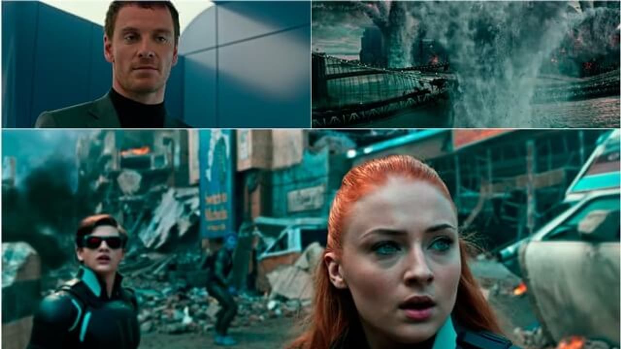
If you’ve noticed that many summer blockbusters share a similar visual style, you’re not imagining it. The ‘Orange and Teal’ color grade dominates big-budget films because it creates dynamic contrast that makes characters and action pop on screen. This look isn’t an accident—it’s a carefully planned collaboration between production design, wardrobe, cinematography, and post-production color grading. From pre-production decisions on costume and set colors to on-set lighting choices, the palette is designed to maximize the impact of complementary colors. In post, colorists selectively boost warm orange tones in skin and highlights while cooling shadows and backgrounds into teal or blue hues. This balance enhances visual depth and keeps audiences engaged.
Planning the Orange and Teal Palette During Pre-Production
The success of the Orange and Teal effect starts long before the camera rolls. Art departments and costume designers select warm tones—rich oranges, ambers, and golds—that will stand out against cooler backgrounds. Production lighting rigs are set up to enhance these colors, often using tungsten or warm key lights balanced with blue or teal fill lights. This strategic color planning ensures that the footage captures the necessary contrast for the colorist to amplify in post. Early collaboration between directors, cinematographers, and colorists can save time and cost by avoiding costly fixes later in post-production.
Color Grading: How Post-Production Creates the Signature Look
Color grading is where the Orange and Teal look truly takes shape. Skilled colorists isolate skin tones and warm highlights, boosting their saturation and brightness to create that inviting orange glow. Simultaneously, shadows and backgrounds are shifted toward teal or blue hues, which complement the warm tones and add cinematic depth. This process requires precise masking and tonal adjustments to avoid unnatural skin colors or loss of detail in shadows. The colorist’s role is crucial in preserving the emotional tone of the scene while enhancing visual appeal. For brands and agencies, understanding this step can help set realistic expectations for timelines and budgets.
Why Do Blockbusters Favor Orange and Teal? The Psychology and Practicality
The popularity of Orange and Teal isn’t just about aesthetics—it’s rooted in color theory and audience psychology. Orange and teal sit opposite each other on the color wheel, creating high contrast that draws the eye. Orange evokes warmth, energy, and human connection, while teal and blue suggest calm, technology, or mystery. This combination highlights actors and key story elements against vibrant, cinematic backgrounds. Additionally, the look works well with the explosion-heavy, fast-cut action sequences typical of summer blockbusters, making effects and stunts visually striking. For commercial productions, adopting a similar approach can elevate brand storytelling by focusing viewer attention and enhancing mood.
Applying Orange and Teal in Your Own Video Projects
While the Orange and Teal look is iconic in Hollywood, it’s not a one-size-fits-all solution. For your brand or agency project, consider whether this color palette supports your story and audience. If you want to evoke excitement, energy, or a modern cinematic feel, collaborating with your production and post teams to plan wardrobe, sets, and lighting around complementary colors can pay off. However, avoid overusing the look just because it’s trendy—authenticity and alignment with your message matter most. Working with experienced colorists and cinematographers who understand how to balance these tones will help you achieve a polished, premium finish without sacrificing your brand’s unique identity.
FAQ
What exactly is the Orange and Teal look in film production?
The Orange and Teal look is a color grading style that emphasizes warm orange tones in skin and highlights while shifting shadows and backgrounds toward teal or blue hues. It creates high contrast and visual depth, making characters and action stand out on screen.
How early should I plan for the Orange and Teal look in my video project?
Planning should begin in pre-production with your art department, costume designers, and cinematographers. Selecting wardrobe and set colors that complement this palette and coordinating lighting setups on set will ensure the footage captures the contrast needed for effective color grading in post.
Can the Orange and Teal look work for corporate or branded videos?
Yes, but it depends on your brand’s story and audience. The look can add cinematic polish and energy, but it should align with your messaging and tone. Collaborating with experienced production and post teams will help tailor the effect to suit your project without feeling forced or generic.
What should a team understand about Why all Summer Blockbusters Look the Same?
The useful takeaway is how audience, creative direction, production choices, post-production, approvals, and delivery needs shape the final video plan.
Where should this kind of project start?
Start with the goal, audience, deadline, where the finished piece needs to live, and the practical constraints that will affect creative and production decisions.
How can ECG help with the next step?
ECG can help connect the creative idea to production planning, filming, post-production, versioning, and delivery so the finished work fits the channel and the audience.